
YOGA POD
Overview
Yoga Pod is committed to helping their members build physical skills, challenge their limits, and achieve a greater sense of presence. Through a variety of classes, convenient times, and studio locations across multiple states, Yoga Pod provides a highly intense and incredibly mindful form of fitness.
However, since Yoga Pod began franchising 10 years ago it has only been able to franchise 12 locations. To grow their customer base and entice entrepreneurs, Yoga Pod needed a clean and cohesive website. I redesigned the website, both structurally and aesthetically, to encourage new users to sign up and to help existing users easily navigate through the website.
Role
This was a hypothetical redesign project that I took upon myself to improve the user experience and website structure. I conducted research on Yoga Pod’s business’ goals while keeping the users needs in mind. After gathering data from the existing product, user reviews and surveys, and Yoga Pod’s competitors I was eager to start redesigning.
Methods Used
Heuristics, Competitive Research, User Interviews, Affinity Map, Feature Prioritization, User Persona, User Flow, Problem Statement, Sketching, Usability Testing, Trends & Forecasting
Tools
Figma, Illustrator, Zoom
Timeline
3-Week Sprint (January 2022)
Challenge
The current Yoga Pod website is difficult to navigate - it lacks an intuitive design and the UI changes from studio to studio. A lot of the necessary information, like booking a class or signing into an account, is laborious to find. Existing users need a way to easily locate their account and book classes while new customers need a direct Call to Action (CTA) and an easy introduction to the UI.
Outcome
To grow Yoga Pod’s web presence, I redesigned a website that now reflects the core interests, goals, and needs of the user. After testing, I found that users needed an interface that was easy to navigate and one that saved them time specifically when booking a class and finding their account. I worked diligently to provide solutions which included creating:
An onboarding process that established a clear CTA and introduction to the website
An easy way to book and cancel classes
An account page where users can view their progress and manage their account
Highlights of each class and what to expect
I was able to help users save time and effort from the redesigned Yoga Pod website, but how exactly did I get there?
Read more about my research process below.
The Current Platform
A Closer Look at Yoga Pod
To kick off the research process, I needed to take a close look at Yoga Pod’s current platform to gauge what the platform was doing well and what could be improved for the redesign. I noticed that while the existing platform was informative, it was often unclear what actions the user were being called to take.

The platform redesign needed:
01 An Intuitive Navigation
02 User Log in and Account
03 A Clear Call to Action (CTA)
Competitive & Comparative Business Analysis
What is Trending in Athletic Studios?
Now that I had a better understanding of the current platform, I looked to Yoga Pod’s competitors to better understand what features were offered in the yoga and fitness studio domain. Understanding market trends helped me to learn what features and solutions could give Yoga Pod a competitive edge
Here’s what I learned:

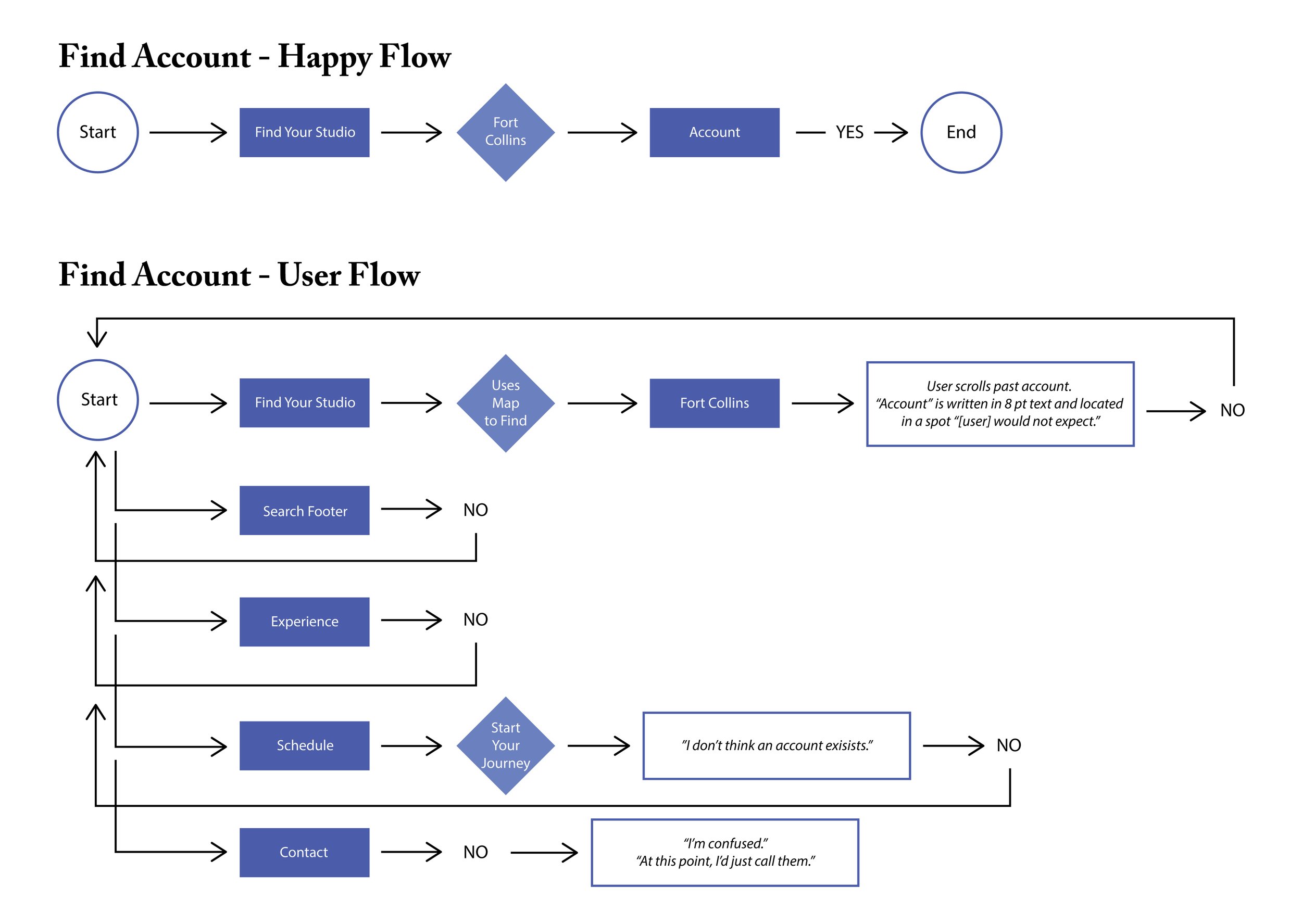
User Flows & Happy Flow
What do users want?
I interviewed 4 participants who matched Yoga Pod’s wide demographic asking each participant to imagine themselves as new members of Yoga Pod and to use the website to (1) find Yoga Pod’s new membership deal, (2) find their account, and (3) book a class.
While testing, I found that it took an average of 2 minutes for participants to find a link to book their classes and even longer to find their account. All participants displayed signs of frustration as many paths were not linked to the outcome they were expecting.
Below is an example of the current website’s happy flow followed by an example of one participant’s user flow.
Problem Statement
Balancing the User & Yoga Pod

* Problem Statement
The users of Yoga Pod need a way to book and cancel classes, view their account, and track their progress so they can conveniently use the website and stay on top of their goals.
Design Studio
Designing the Solutions
After user testing and general research, the highest goals to implement into the design where:
Reducing the number of steps to minimize time to completion
Establishing a clear visual form of hierarchy and information architecture
Limiting unnecessary copy
Onboarding
I wanted to design an onboarding process that guides new users to a faster action and show them how they can book their first class.
Navigation Bar
I simplified the navigation and used the necessary copy needed for users to complete their objectives.
Booking a Class
As the primary function of the website is to book a class, I wanted to make sure the feature was straightforward. There are three ways to book a class. Using the navigation, users can book a class through the “Schedule” link or by picking a specific class in “Class Types.” Users can also directly link to the class “Schedule” inside their account page.
Call to Action (CTA)
There is a primary and secondary location for the CTA highlighting Yoga Pod’s new membership deal.
Account
Users can now see their class history and current classes booked giving them an insight towards their goals and the progress they have made. They can also manage their account, see their payment and membership details, and view the safe studio practices all from the account page.
Feedback
Validating the designs
After testing my high fidelity prototype, I received positive feedback from users about the simplified configuration of their tasks, saving them a large proportion of their time and reducing their efforts.
Here are the major areas of improvement:
Reduced the amount of time it took to find the account page from an average 2 minutes to an immediate pinpoint.
Reduced the amount of effort it took to book a class by creating “happy paths” – the path(s) users are expected to take to achieve their goal.
Streamlined the users moment of action through onboarding
Eliminated decision fatigue by creating a meaningful CTA
Removed the friction between website and users
Here’s what users had to say about the redesign:
